

Why Mobile-Friendly Email Design is Important
You know that email marketing is important — that’s why you’re here. But have you ever thought much about how your emails look after you send them?
Chances are, you’re designing your emails on a computer screen that’s at least 11 inches (the size of some Chromebooks). If you’re using a MacBook Air or Windows laptop, your screen is most likely at least 13 inches in size. There are tons of pixels to display every beautiful graphic and word in your email!
However, 50% of your email subscribers — if not more — are going to read your gorgeous email on a small mobile device screen. If you aren’t optimizing your emails for mobile, your subscribers aren’t going to be able to read all of your content. And as a result, you’re going to bring your open and click-through rates down.

What is good mobile email design?
So, what does it mean to optimize your emails for mobile devices?
There are a few parts to the process but the very first thing you need to do is make sure you are using responsive email templates. These templates will look just as good on a desktop as they do on a smaller screen or mobile phone — you don’t need a separate mobile version of every email. No matter the device, you’ll deliver a good user experience when you use responsive design elements.

Different devices have different pixel widths that limit how much can be shown on the screen at one time. So you’ll want to use an email design that can automatically resize from a large screen down to a small one without cutting parts of images off or losing readability.
Best practices for mobile-optimized emails
Major email clients have mobile responsive email templates that you can use when designing your next email. While those templates will get you started on the right path, it’s important to remember these best practices, too:
1. Use single-column layouts
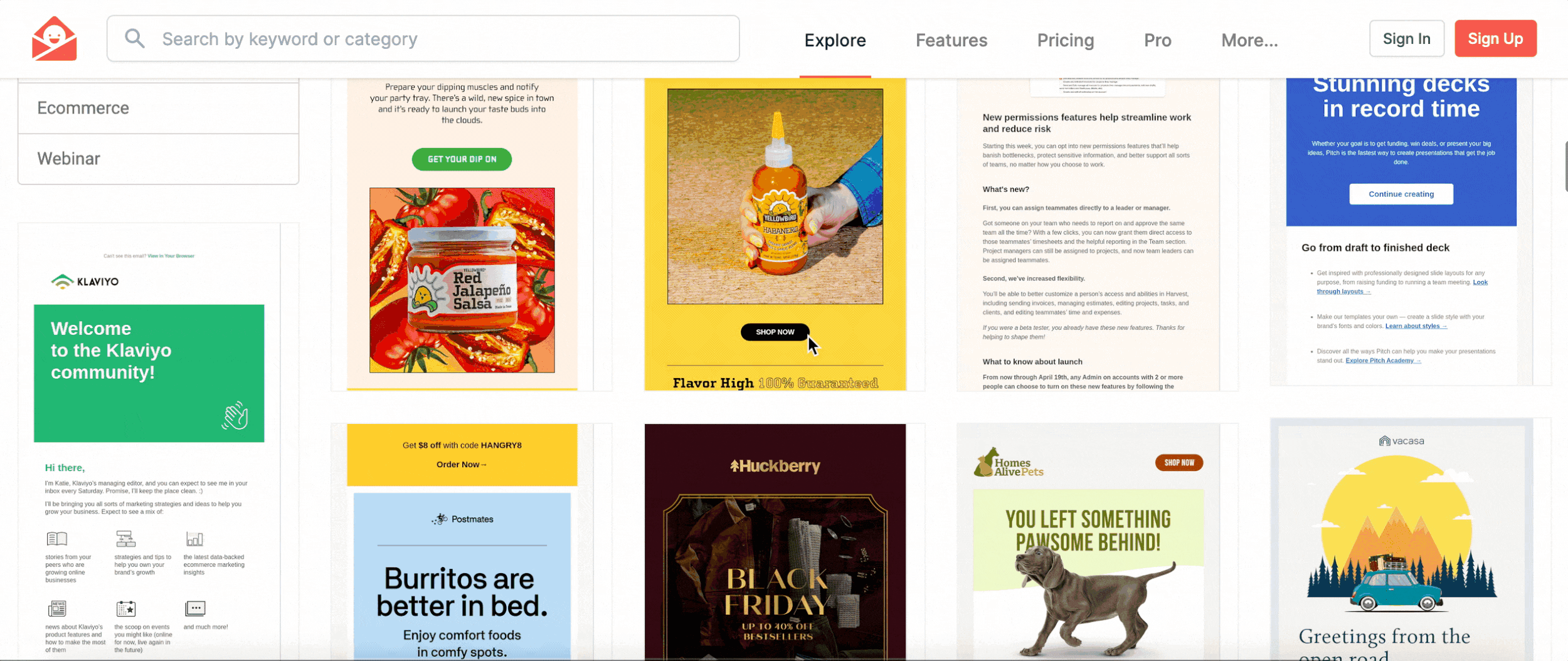
Yes, there are some very pretty multi-column email layouts that arrange images and text side-by-side on desktop screens. But when you try to look at these on a mobile device, the elements will be stacked on top of each other and may not look as nice. By defaulting to a single-column email layout for your emails, you can be confident that they will look the way you want them to on all screens.
Just take a look at all of these examples from Really Good Emails — they’re all using a single-column layout!
2. Use at least a 14 pt. font
Using a minimum font size of at least 14 pt. will help mobile users read your email campaigns. While some devices, such as Apple iPhones, will increase text that’s too small, you can’t be sure every recipient has access to that feature. By using a larger font size, iPhone and Android users alike will get to read your email comfortably.
3. Use bold images
Remember to keep the majority of your email text in the body copy, not images. If you load a graphic with text, it may not be readable on mobile devices. When text is in an image, it can’t be resized by the recipient’s phone or tablet. The image size will just decrease and become hard to read.

Of course, you can still have a few simple, bold words in an image, such as a large “SALE” graphic or something similar.
4. Use pre-header text
Subject lines are more likely to be partially cut off on small screens like smartphones thanks to that pesky pixel width limitation. By using the pre-header text, you can add more preview content to help the subscriber understand what your email is about and why they should open it.
Deliver a great mobile email experience
If you aren’t sure whether or not your emails look good on mobile screens, we can help. Shawley Marketing is experienced in creating email campaigns that convert well across all devices and can guide you toward providing a better mobile experience for your subscribers. Book a call with us today and we’ll discuss how you can have mobile-friendly email campaigns!